In every significant project lies the power to unite, to evoke emotions, and to create a lasting impact. This ethos perfectly encapsulates our collaboration with Ride for Unity, a non-profit organisation committed to the unifying power of sports. As Digital ‘Guru’ & Design Director at Evoke International I took the reins on the aesthetic and graphic output. Evoke continue to support Ride for Unity’s marketing and brand strategies, checkout our work here.
Our collaboration transcended a mere design project; it has been a mission to visually narrate the essence of unity and resilience. We delved into the heart of what Ride for Unity represents, translating its values and goals into a cohesive visual language that resonates with its audience and the wider community.
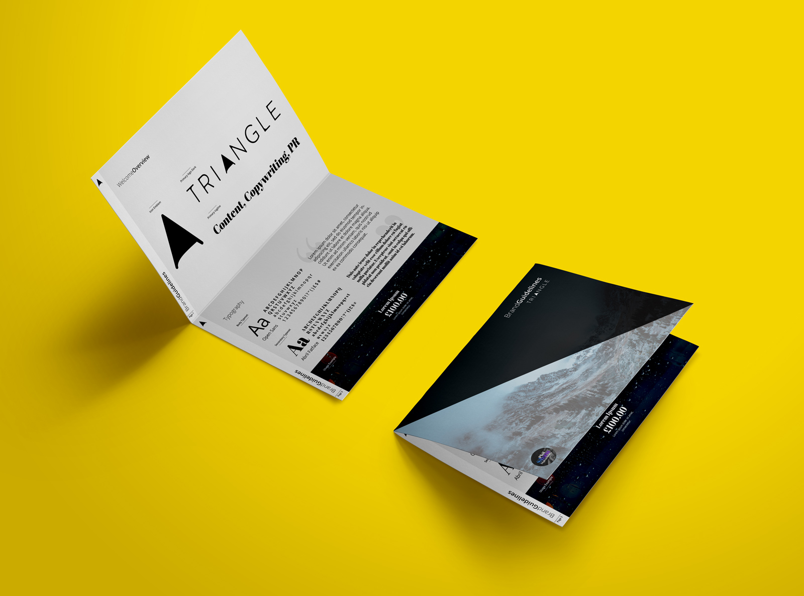
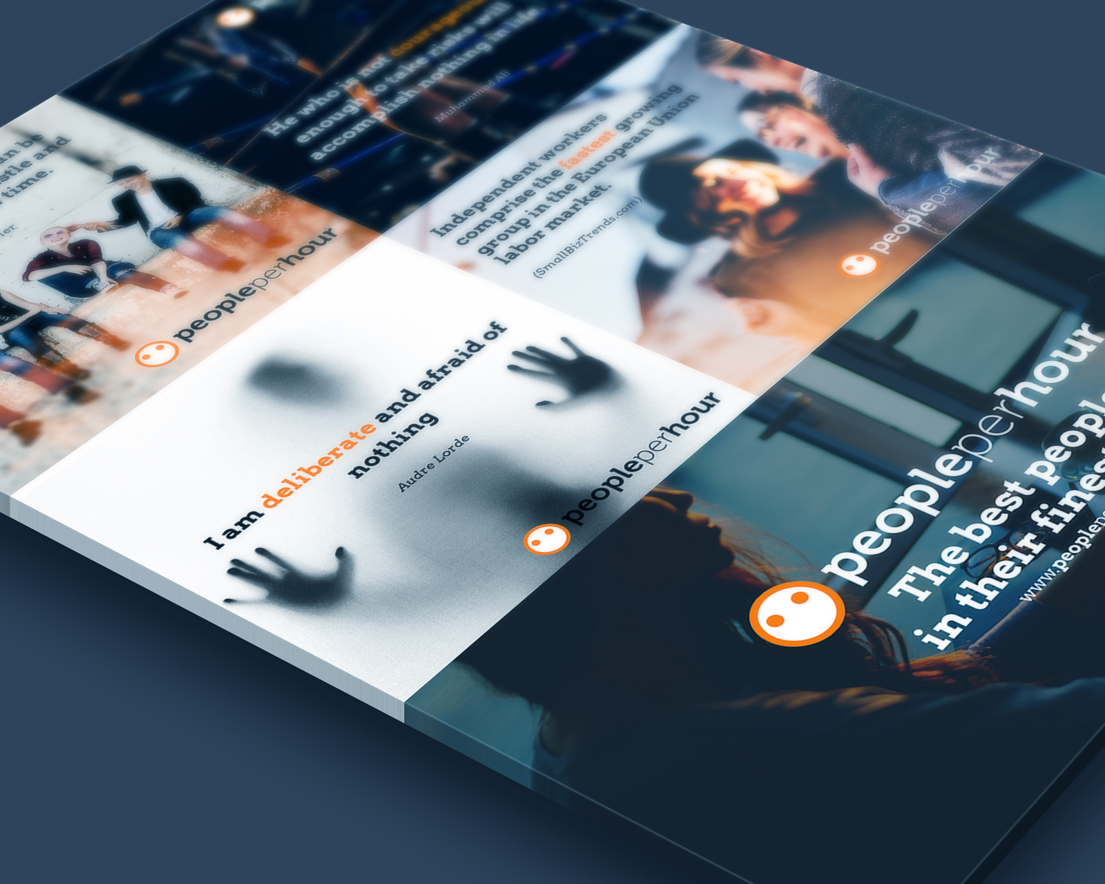
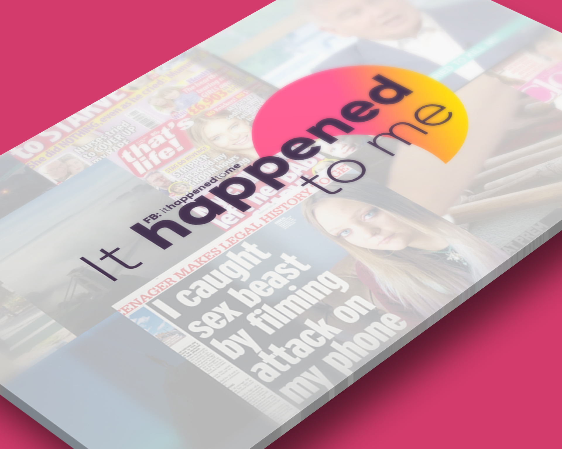
At the forefront of our branding strategy was the development of distinctive word-marking. The choice of typography was pivotal. We opted for bold, impactful typography that stands out yet remains elegantly approachable. This typographic approach mirrored the boldness and determination of the athletes and participants of Ride for Unity, whilst maintaining an inviting warmth that beckons community involvement. Take a look at some examples.
The visual storytelling has extended into dynamic motion graphics and adverts. These elements have brought to life the vibrancy of Ride for Unity’s events, creating a visual synergy that speaks volumes about the organisation’s impact. Our aim was to craft visuals that are not only aesthetically pleasing but also effectively communicate the organisation’s message. Its a bold event!
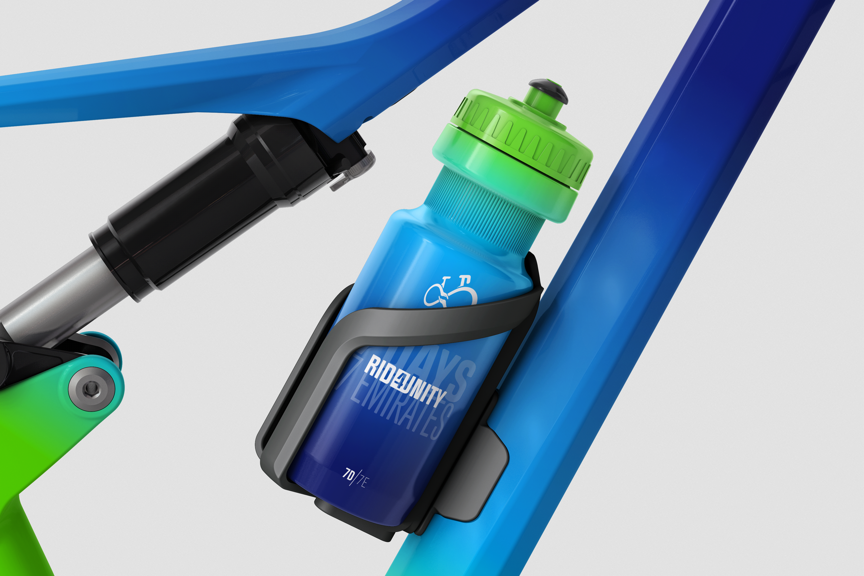
Choosing the right colour palette was crucial. We settled on refreshing cool tones, symbolising tranquillity and harmony, juxtaposed with bold typography to make a strong, memorable statement. This choice of palette reflects the serene yet powerful nature of sports as a tool for unity, especially in today’s complex geopolitical climate. Learn a little more about this in The Geo-Godfather wars podcast.
It goes without saying that the website serves as the digital gateway to Ride for Unity’s world. It was designed to be user-friendly and visually engaging, making it easy for visitors to understand the organisation’s mission, upcoming events, and how they can be part of this incredible journey.
Our strategic approach was comprehensive, considering the demographics of the region, the nature of the event, and the overarching business goals of Ride for Unity. We aimed to create a brand that appeals to a diverse audience and resonates with the values and aspirations of every individual involved.
Working with Ride for Unity has been an exhilarating experience and I’m not even riding! It is a testament to how sports can bridge divides and bring people together, creating a sense of belonging and community. Through our strategic, thoughtful approach to branding, we have crafted a visual identity that not only represents Ride for Unity’s mission but also stands as a beacon of hope and unity in these challenging times.
The journey with Ride for Unity reinforces the belief that when creativity meets strategy and purpose, the result is not just a brand, but a movement that has the power to change lives and bring people together, irrespective of borders and backgrounds.
Check out Ride for Unity, an event could be coming to your country!